Five Hot Trends in Graphic Design
All graphic designers know trends come and go. Some linger through time while others fade away only to resurface years later. Designers may argue that some trends aren’t trends at all, such as flat design which has been around since the early years of printmaking in Switzerland. No matter which side of the debate you fall on, be thankful the days of X-Acto knives, T-Squares and rubber cement are over. Sit back, fire up your Mac and take note of these five hot graphic design trends that should be in your portfolio.
Minimalism and Flat Design
Designer Luke Clum says it best: Flat design is a minimalistic design approach that emphasizes usability. It features clean, open space, crisp edges, bright colors and two-dimensional/flat illustrations. Minimalist design doesn’t mean boring. It means viewers can interact with the information presented in a fast and easy way. These days, it’s all about the user experience.
The old adage “Less is More” applies here. By using minimalist design, the focus is on the message being conveyed. It also brings a sense of simplicity yet sophistication.
http://preferredmode.com/2017/01/24/brian-3/ Consider the Tripfinder app for smartphones:

Creative and Bold Typography
Typography is the art of arranging type in a way that captures our attention and makes a statement. It can add some spunk and personality to a design or lead to an epic fail. As HubSpot reminds us, typography is everywhere, from billboards to book covers to coffee cups.
In this example from Risa Rodil notice how sometimes words are all you need. There’s no need to get carried away. A best practice is to use no more than two contrasting typefaces at one time. The main consideration is readability.
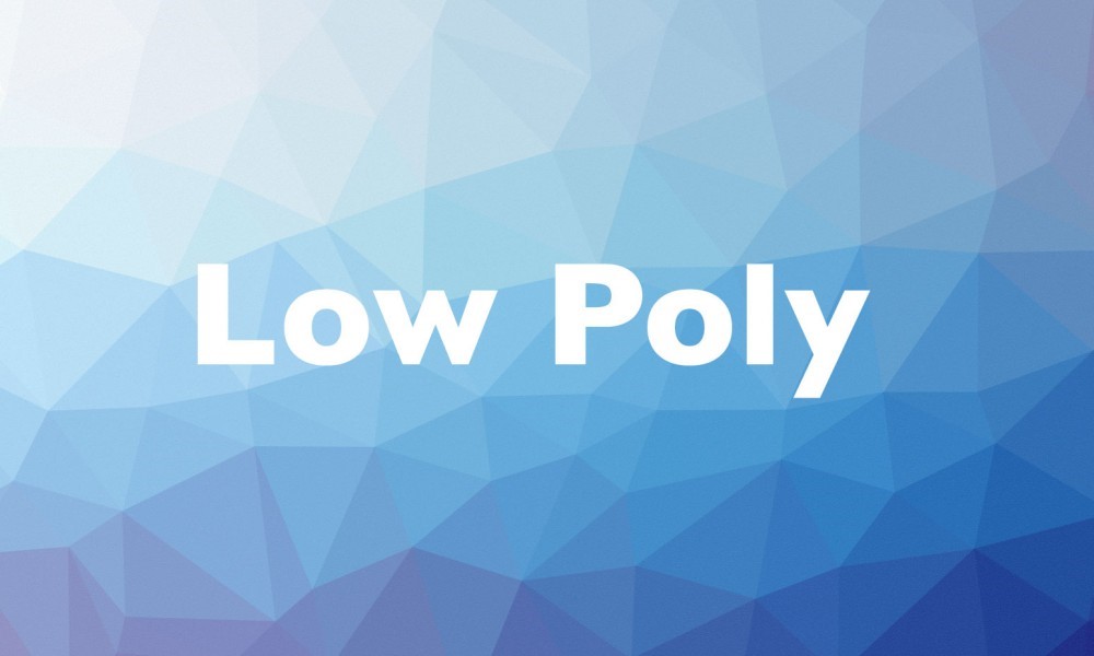
Geometric Shapes and Low-Poly Effects
The Notes on Design website provides an excellent definition of low-poly art: “Simple geometric shapes placed side-by-side to create angular, often minimalist, compositions.” A variety of shapes is used to provide meaning and convey emotions in design. In fact, they can help create movement, add depth and lead the eye in a certain direction.
According to this blog, shapes are the building blocks of visual grammar, each with certain characteristics that communicate different messages to an audience.
Here is an example from Designrope.com.
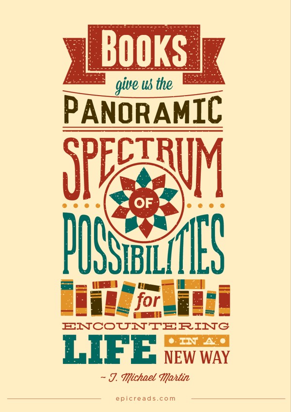
Everything Old is New Again: Modern Retro Style
The Design Shack says modern retro style is a technique that “uses hints of design patterns from the 1970s, 1980s and 1990s as a basis for projects” and provides an “immediate connection between the design and the user.” It conveys a feeling of nostalgia that viewers can relate to. Check out this example from Behance.net to see what we’re talking about.

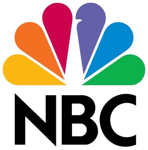
A Positive Use of Negative Space
Negative space is the area surrounding an object or image. When used purposefully, it can have a dramatic effect. In this example, provided by Creative Bloq, the famous NBC peacock is displayed in negative space. They also provide many other examples.
Staying on top of the latest trends will keep your designs current and perspectives fresh. If you are a creative professional in DC, Dallas, Houston or New York, let us help you find your next dream project. While we are known for placing top marketing talent we are now helping creatives just like you. It all starts with the Talent Profile so don’t be shy, set yours up today.